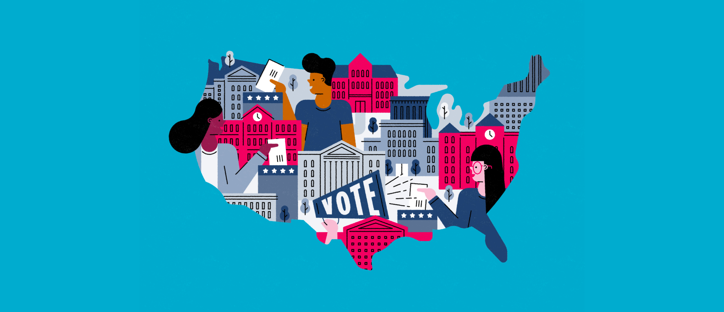
Voter Registration App
Smoothening Voter Registration Process in the U.S.
This project is a design challenge given by Goldman Sachs New York Office to design a voter registration app that helps a first-time voter register to vote in an American election. The design goal is to make the registration process as seamless as possible.
As an international student who is not familiar with the American election, this is a great learning experience to design for unfamiliarity, security, and information architecture. Please note that this project has no affiliation with the US Government and does not reflect any political opinion.
PROJECT TYPE
Design Challenge given by Goldman Sachs New York Office
MY ROLE
Individual User Researcher & UI/UX Designer
DURATION
2 days
TOOLS
Figma, Adobe CC


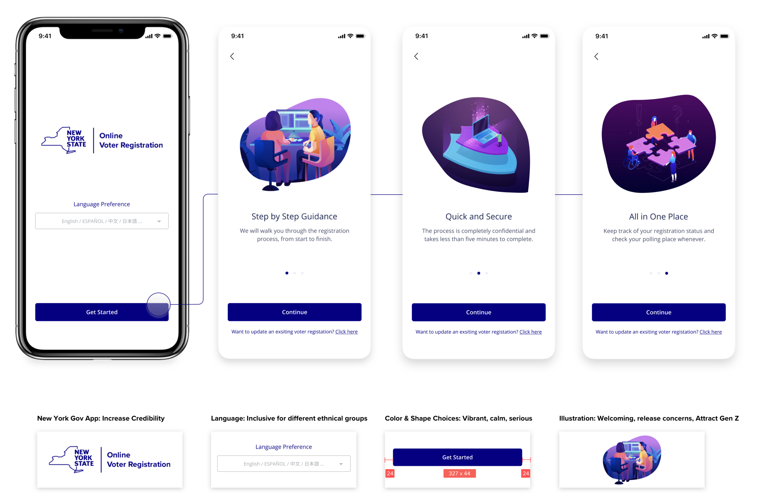
Start with Confidence
Trust us! App from the state government.
Don’t worry! We will guide you step by step.
Clean and simple style to reduce mental load.
Inclusive for different ethnical groups and use cases.

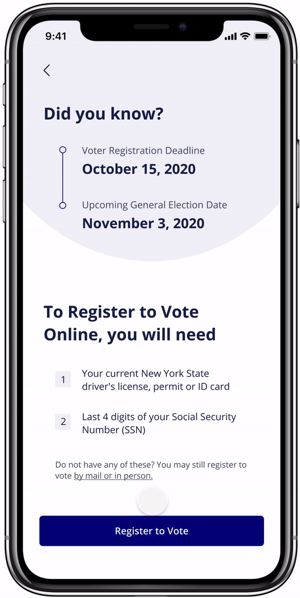
Check Your Eligibility
Check registration eligibility and requirement easily.
One question at a time for early feedback, user engagement, and double confirmation.
Straightforward questions with an option to learn more.

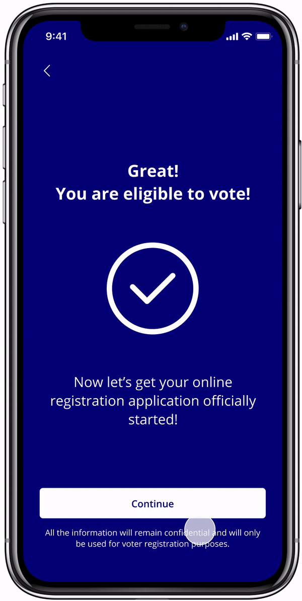
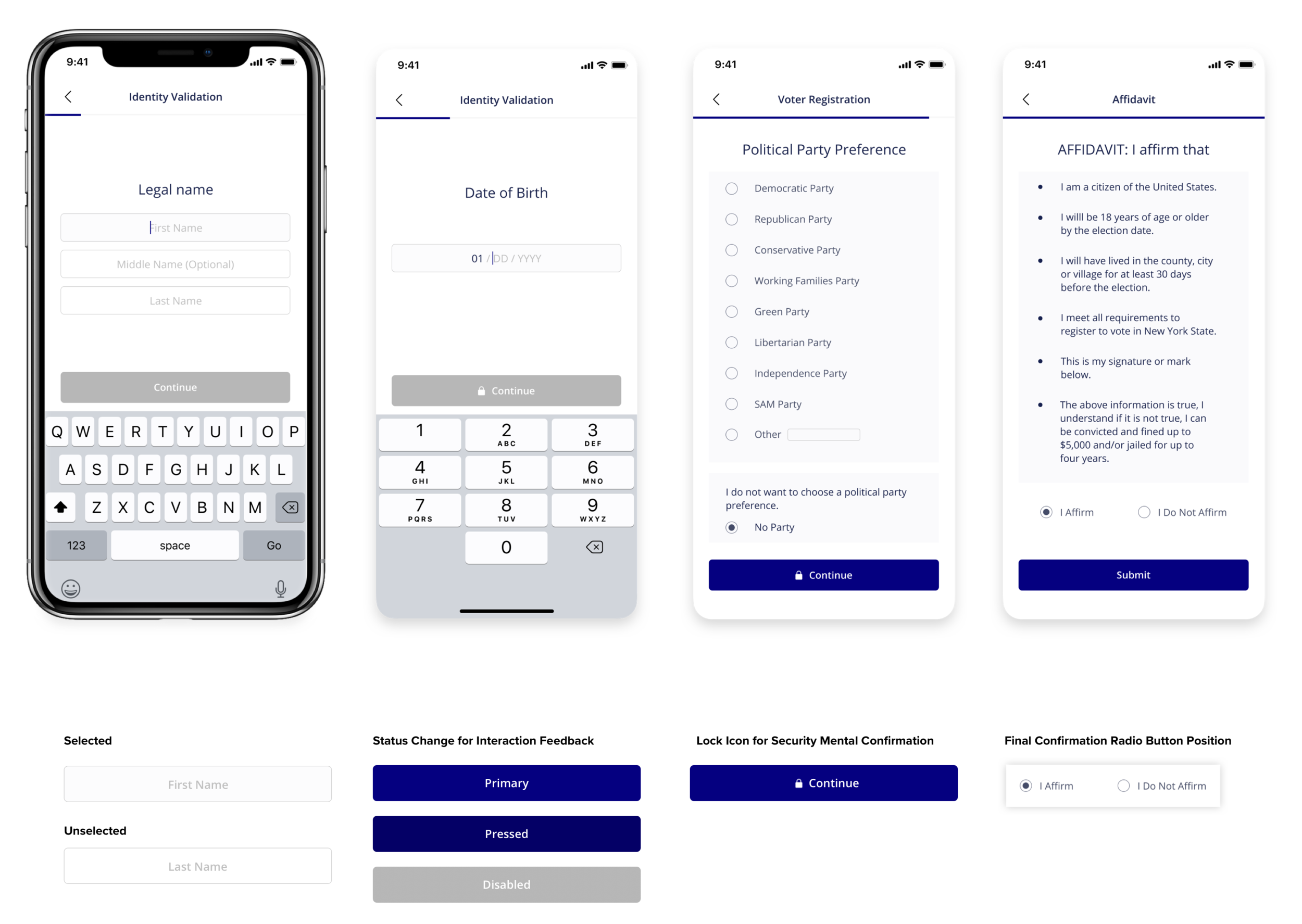
Register in seconds
Multi-screen system for better security and avoiding information overload.
Progress bar to help users stay confident.
Status change for early feedback and interaction.
Pre-filled placeholder to provide hints for inputs.

Find Your Polling Place
Confirmation email receipt for user confidence
Direct access to local Polling Place
Get direction in the map or add a reminder to the calendar

Design Challenge
A user wants to vote for the first time in an American election and hasn’t yet registered. Design a voter registration app that helps user to:
Validate Identity
Register to vote
Find local polling place (date + location).
Design Goal
An app that makes registration process as seamless as possible for this user.
Understand Context
01. “How does voting in America work?”
a) “American election” happens across federal, state, and local levels.
b) “Voting Regulations” are different from state to state.

02. “Who are the first-time voters?”
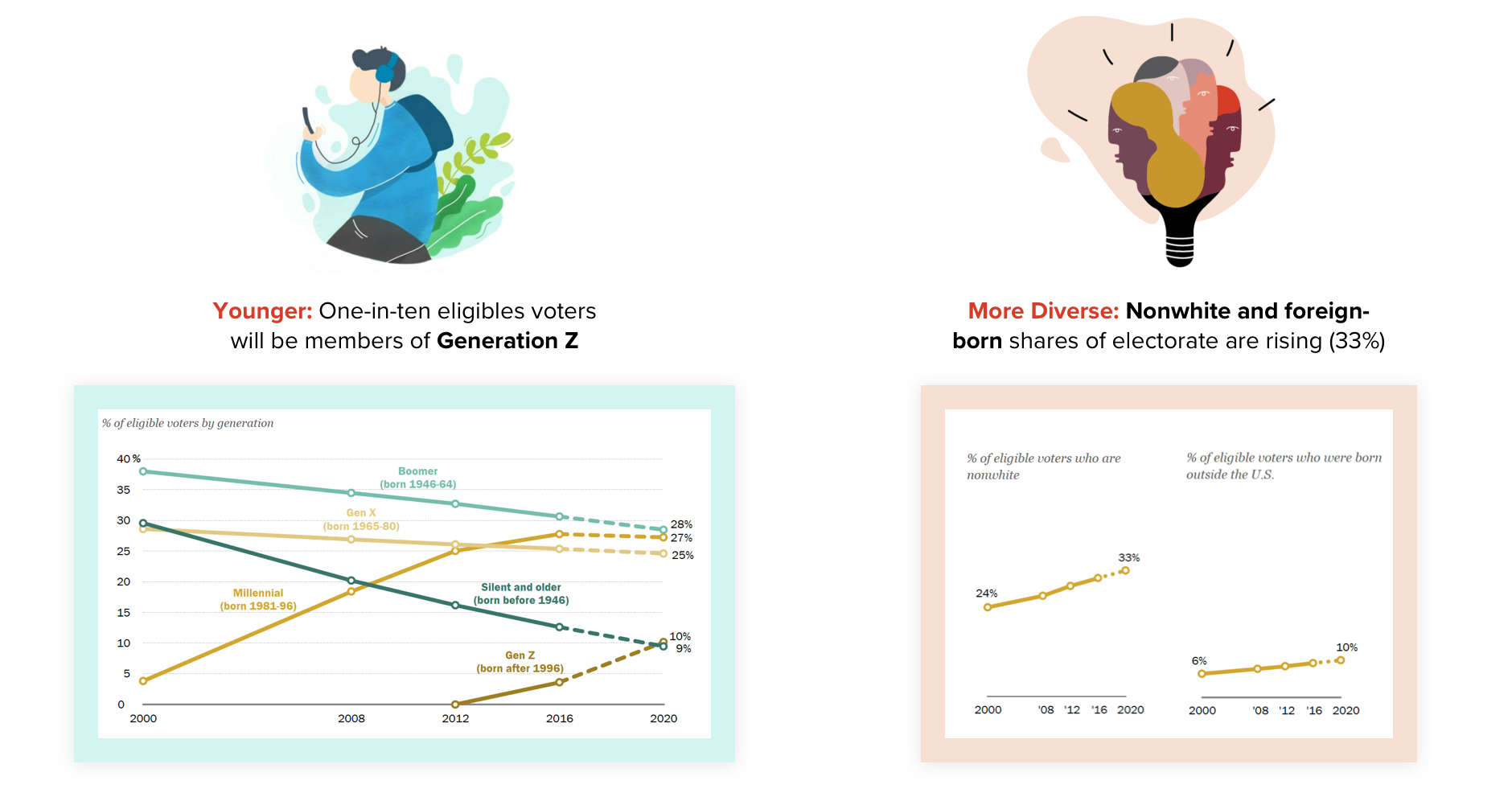
03. “How is their current registration experience?”

I interviewed 4 immigrants & Gen Z to understand:
What are their context and current behavior?
What are their frustrations?
What are their goals and needs?
What are the benefits I can provide?

User Journey
01. I summarized all the interview findings into the persona of Rainie.

02. User also showed some concerns during the interview:
Credibility: Third-party / State / Federal app?
Privacy: Virtual Account / Login?
Security: Will the information be safe?
Acceptance rate: Will people accept a mobile phone as the registration platform?
03. Resolve concerns by secondary research:
Credibility: Build a state app
76% states’ online voter registration systems are built by the state. States vary in how they manage their systems
Users trust government platforms more
Privacy: No virtual account / Login
Users don’t feel comfortable storing sensitive information in a virtual account.
Security: Multi-screen systems
All states have security procedures and protocols in place.
Multi-screen systems are harder to hack.
Platform: Trend of migrating to mobile
State requirement works.
Comparative Analysis
I then analyzed States’ Registration Platforms and Business Apps to better understand:
What are the key questions to include during the registration process?
How to make a great on-boarding/registration flow?


Ideation & Exploration
01. Sketch Out Key User Flow
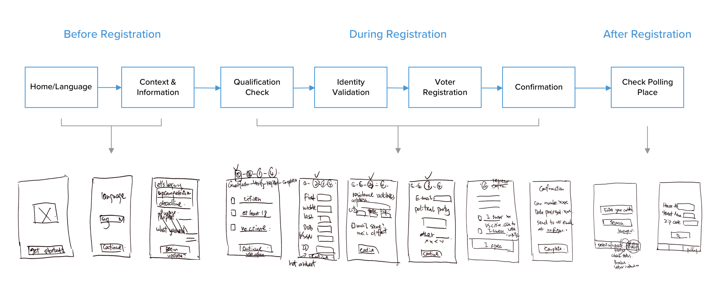
02. Initial Wireframe
03. User Testing Takeaways & Design Exploration
Separate information to reduce mental load
Consider paths outside of the happy one
Rethink about design patterns/choices
More inclusive: language preference, homeless, accessibility

Style Guide: Make sure to keep design consistency


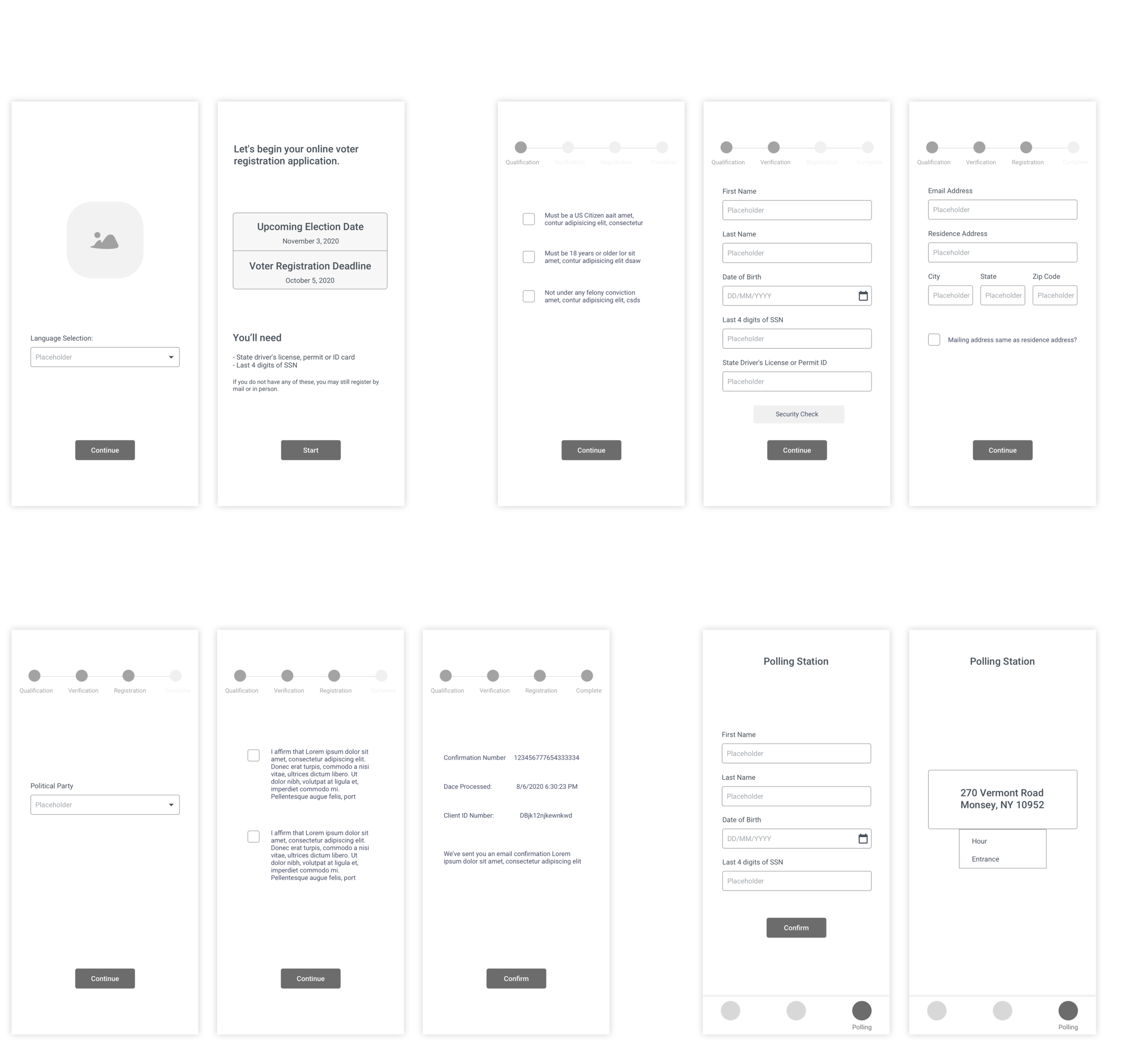
Final Design
01. Before Registration / Home & Walkthrough

02. During Registration / Check Eligibility


03. During Registration / Register to Vote

04. After Registration / Check Polling Place & Next Steps

Reflections
Challenges:
Politics and U.S. Voting is an area that I am not familiar of at all, therefore it took me a lot of effort to study from the beginning about America Politics and different terminologies about the process.
As an international student, I don’t have the necessary government documents in order to experience the user journey myself. But there is always ways to work around it: e.g. talk to people that have had the experience, ask friends to screen-share but also cross out private information, etc. Don’t be limited by the way of solving problems.
Takeaways:
Scope down the project based on constraints from the very beginning.
Make happy path first as a key user flow, then be considerate about different situations.
Iterate design based on user feedback - but I need to evaluate the feedback first.
Design for inclusiveness: Different ethnical groups, Homeless, People with/without ID.
Potential Next Steps
Collaborate with people that has expertise in voting and UX writing to make sure all the information and statement is accurate.
More user testings on the final stage to make iterations.
Expand feature to generate registration forms for people without SSN or ID.


