Tik Tok Design Challenge
Reimagining how users can interact with each other via Tik Tok China
TikTok is the leading social network platform for short-form mobile video. It was originated in China and has made its way across the world.
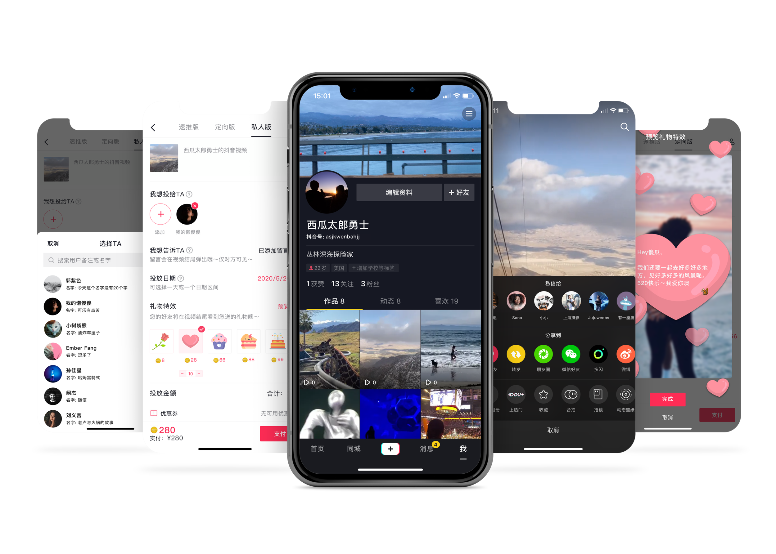
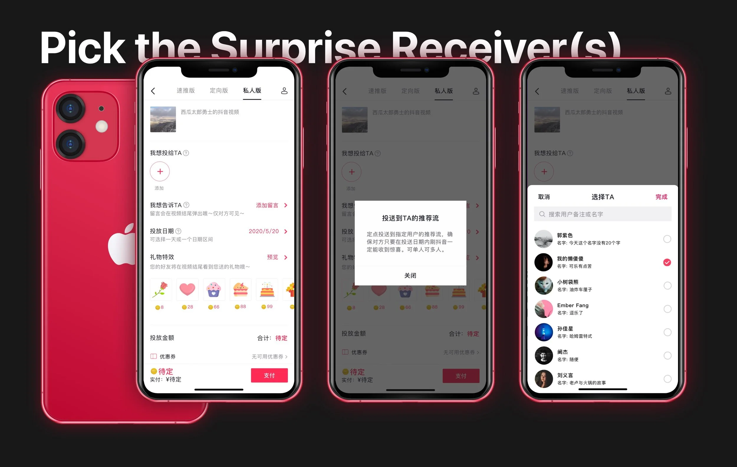
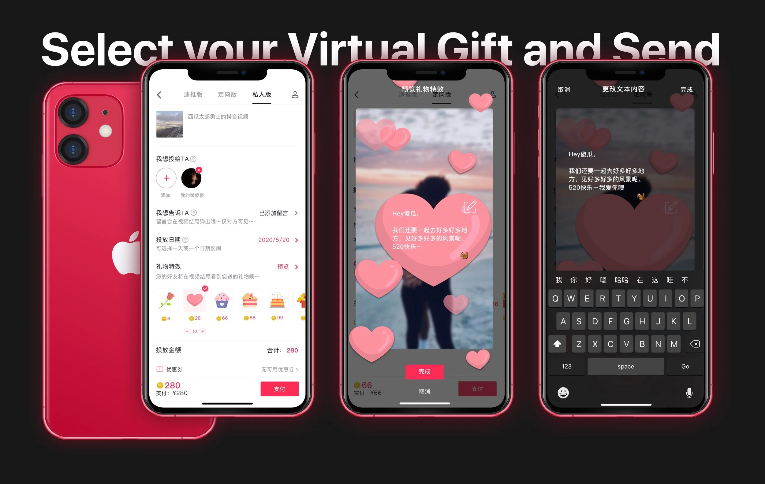
This project is a 2-day design challenge given by Tik Tok Shanghai Office to expand the capacity of an existing function in Tik Tok for business needs. The function is named [DOU+], which is similar to Facebook ads or Instagram ads for video promotion purposes. The challenge I was given is to expand the capacity of [DOU+] so that individual users can target specific content to other specific users. It’s like running a Facebook ad but make it only visible to some particular users.
DURATION
2 Days
PROJECT TYPE
Design Challenge given by Tik Tok Shanghai Office
NOTE
As the design challenge is for Tik Tok Chinese version, the language of the project will be Chinese. Some concepts such as “buying virtual gifts” or “surprise method” are based upon culture design pattern.
ROLE
Individual User Researcher & UI/UX Designer

Process Overview
Analyze the Challenge

Research
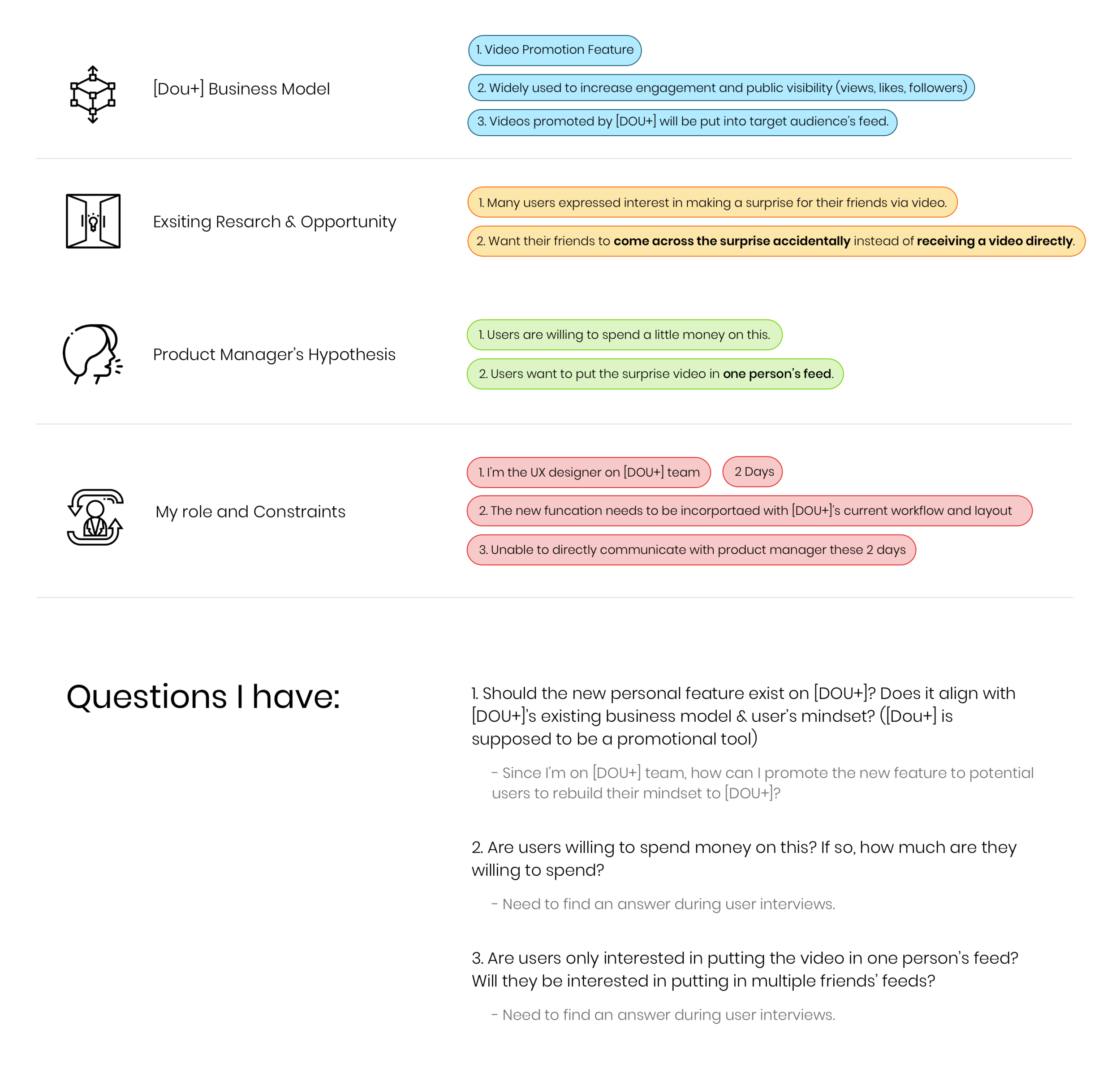
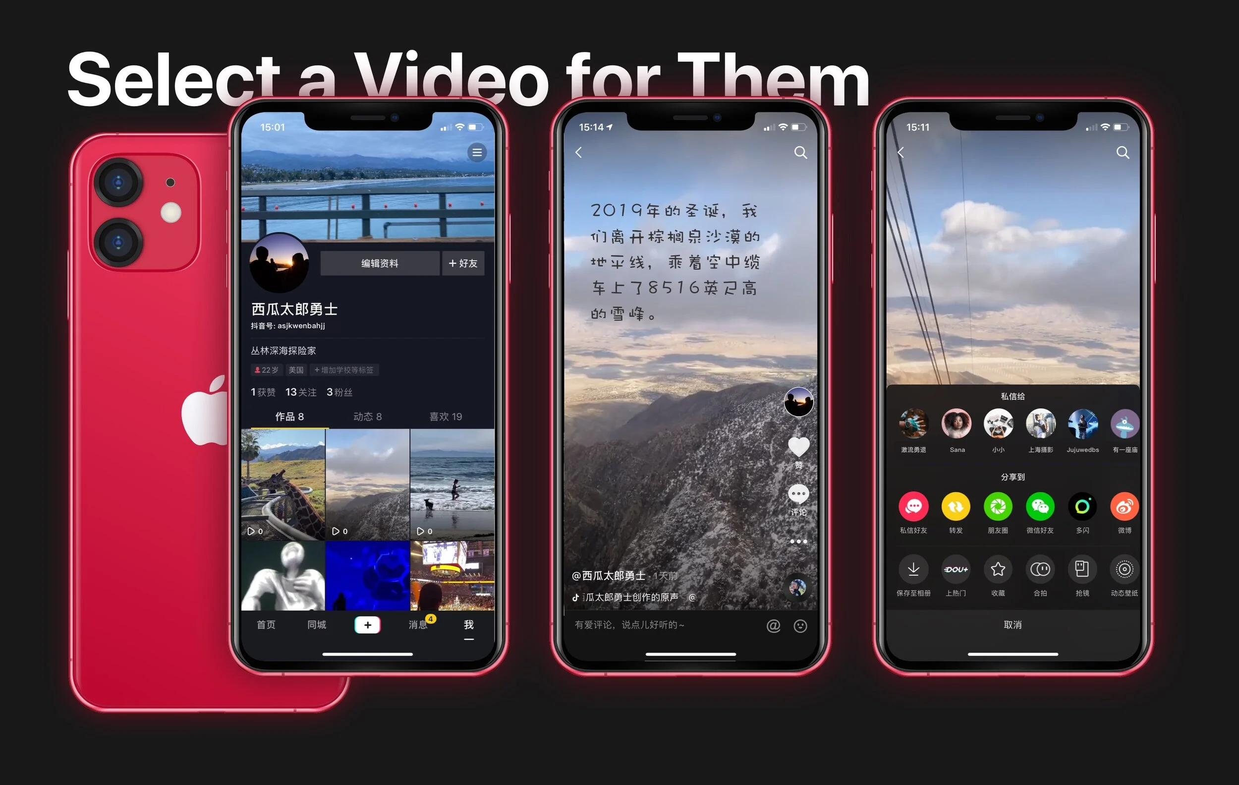
Step 1 : Understand Current Product
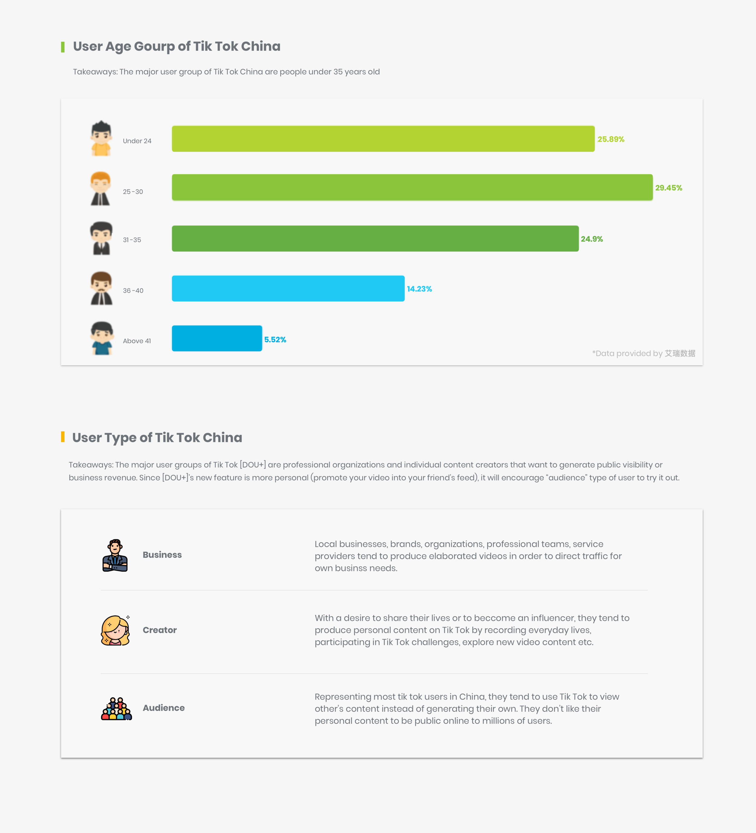
Step 2 : Understand User Base
Step 3 : Qualitative Interview
I interviewed 8 Tik Tok users with age range between 20-35.
Questions include:
User’s behavior pattern : How often do you use Tik Tok? What do you normally use Tik Tok for?
Knowledge of [DOU+]: Have you heard of DOU+? If yes, have you used it? If yes, what do you use it for? If no, what do you think it is used for?
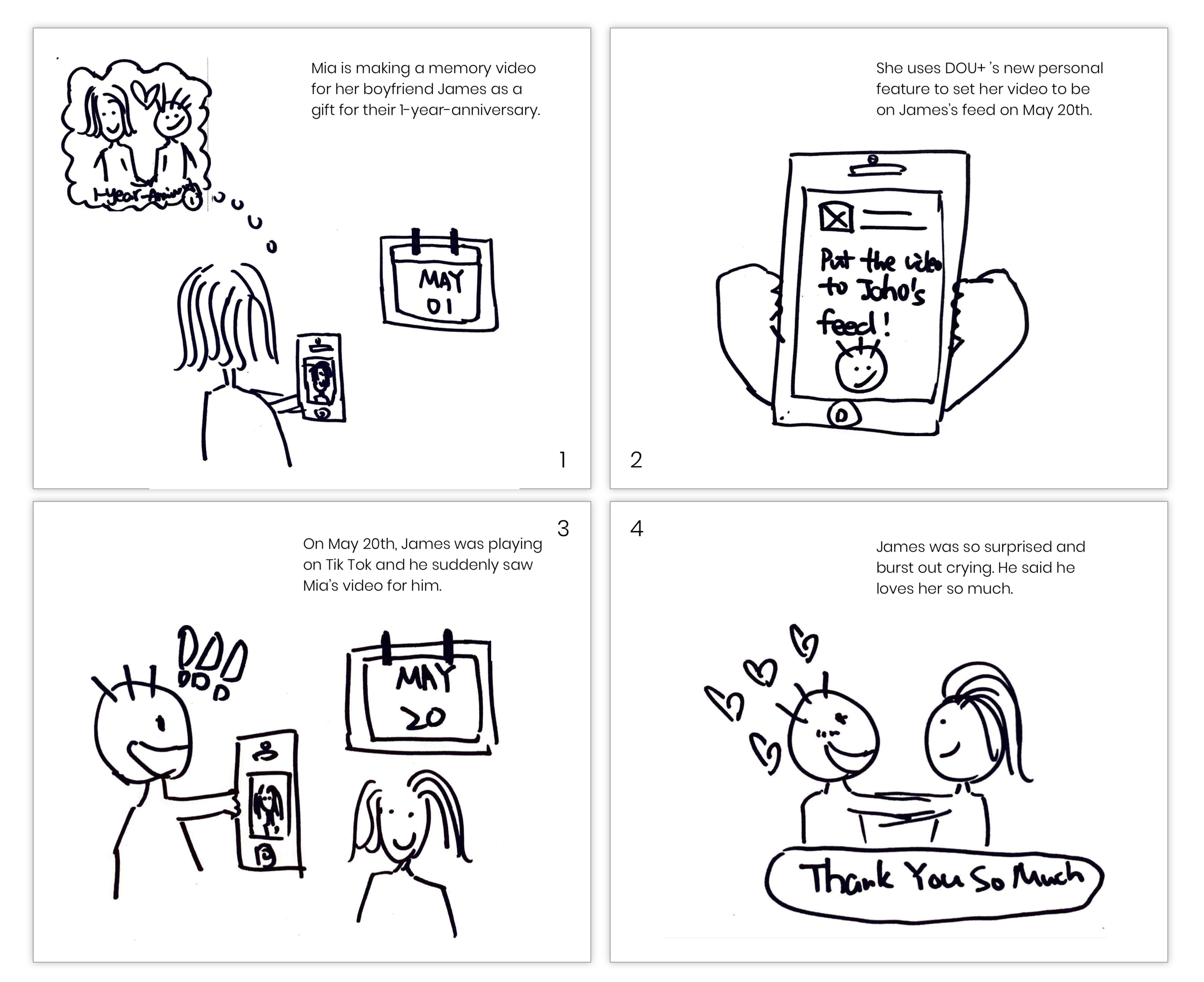
Introduce a scenario: Let’s say you have a boyfriend/girlfriend, and it is your 1-year-anniversary soon. You know your love is a fan of Tik Tok and would love to surprise him/her with a self-made video. [DOU+] has a feature that allows you to put this video into his/her feed on a certain day so that he/she will come across it while browsing through Tik Tok.
Would you be interested in this feature?
Is there any concern or question ?
How much are you willing to spend on it?
Will you be interested in sharing the content with multiple users?
Key Takeaways:
They are all “audience” type of users.
90% of them have heard of DOU+ but haven’t used it. They believe it is for video promotion that business or internet-famous will use.
Even though they don’t like to publish content on Tik Tok, they are very interested in this new feature and are willing to post the video if self-assigned users see it.
Their main concern is:
Want to make sure the other user will see this video for sure.
Want to get the other user’s reactions/replies.
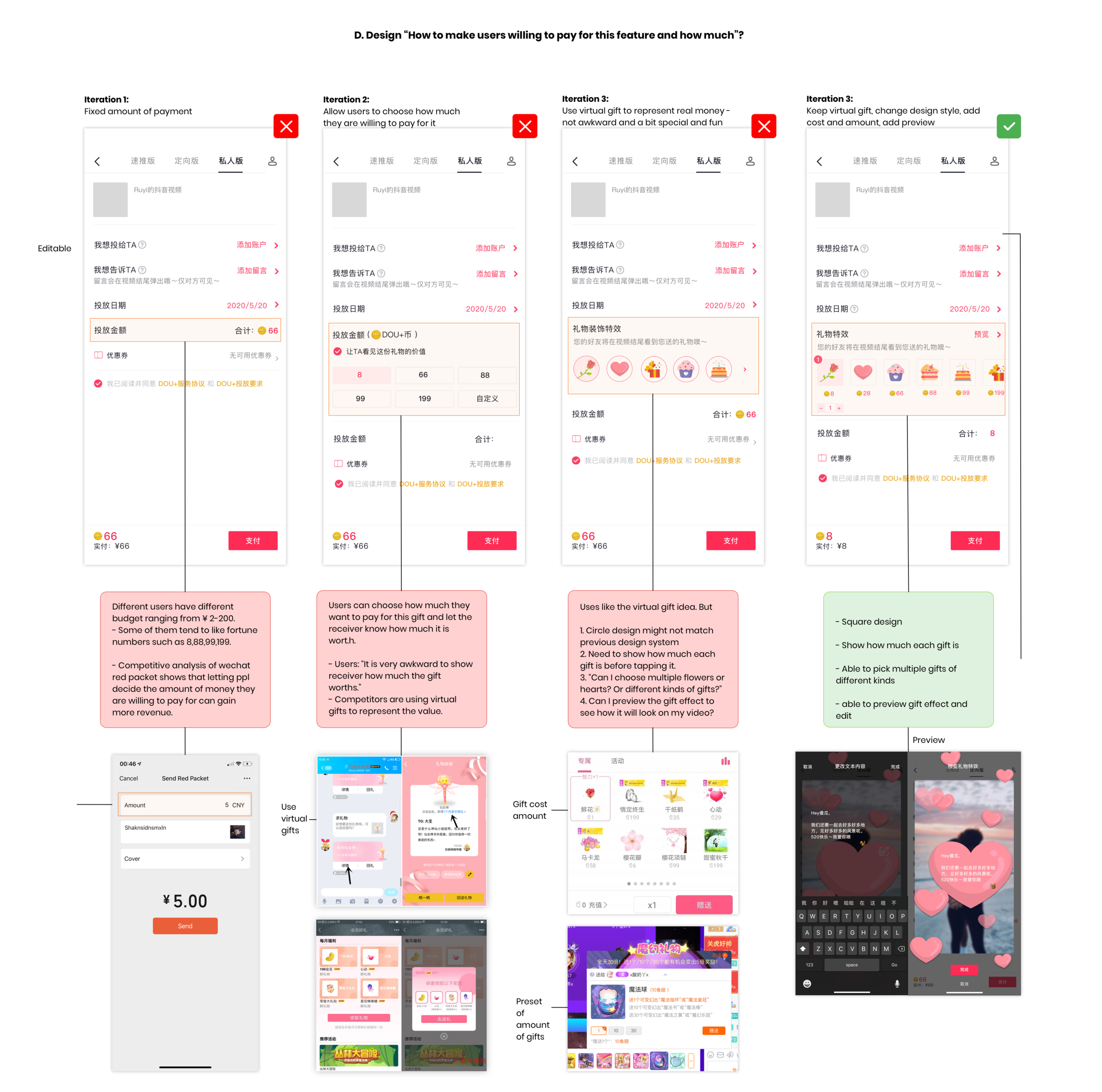
Everyone has a very different opinion of how much they are willing to pay:
¥0-10,¥50-100,¥ 100-200
Depending on the video content, they want to promote it to one user or multiple users
One user: if it is very intimate: e.g., Love letter, memory video, etc.
Multiple users: Child’s birthday, friend’s surprise video, etc.
Step 4 : Competitive Analysis
I will talk about how competitive analysis influences my decision during the ideation/design stage later.
For now, this is an overview of the aspects that I focused on:
Ideation
Step 1 : Persona
Step 2 : Storyboard
Step 3 : Sketches
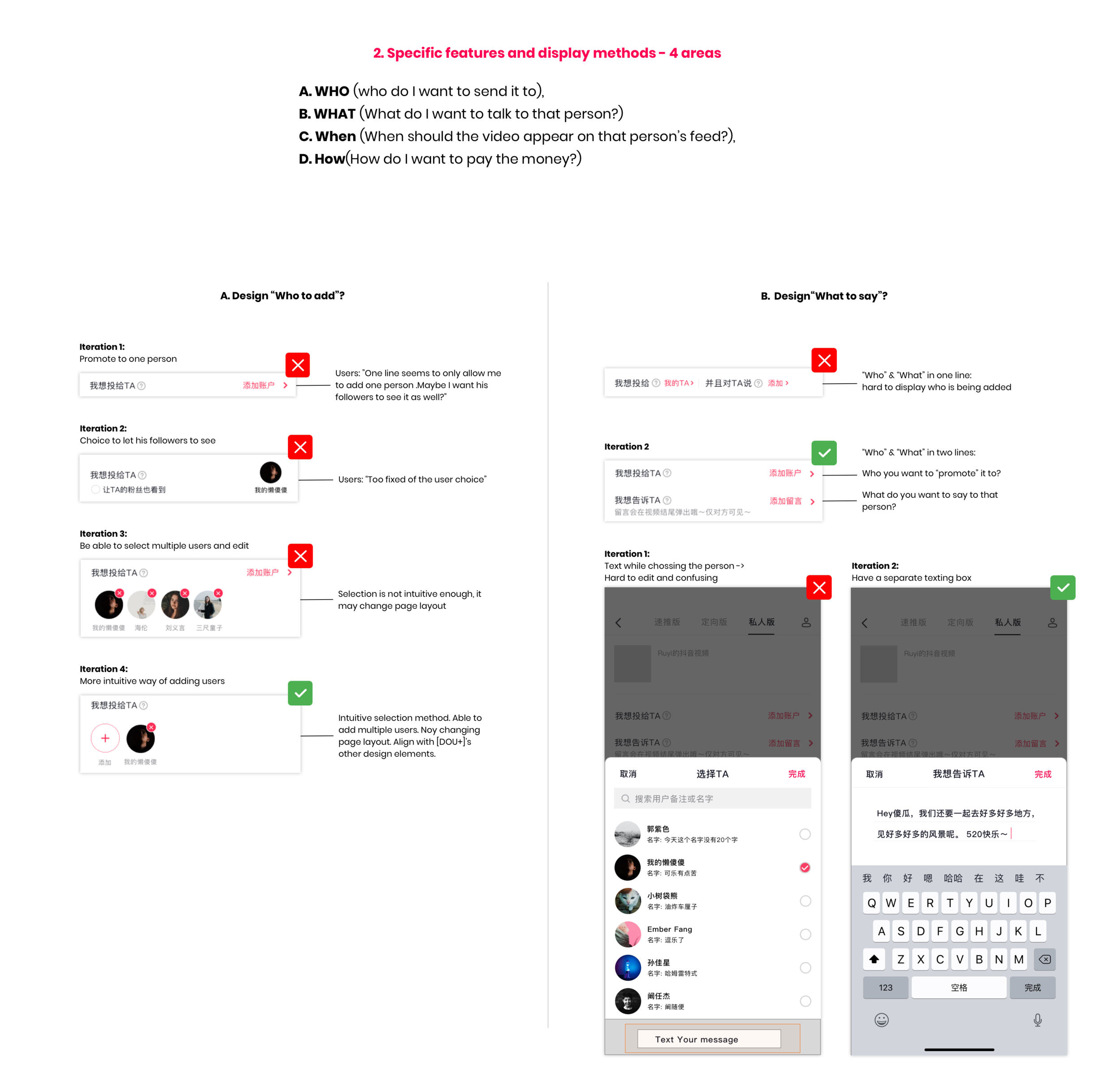
Firstly, I analyzed the workflow and layout of the existing functions - oriented promotion & quick promotion to see the relationship between payment and variable change. Then, I predicted the workflow of “personal promotion“ based on user interviews.
Secondly, I did some explorations and brainstorms of general layout.
After that, I quickly moved to the wireframe stage for A/B Testing.
Step 4 : Wireframe & Iteration

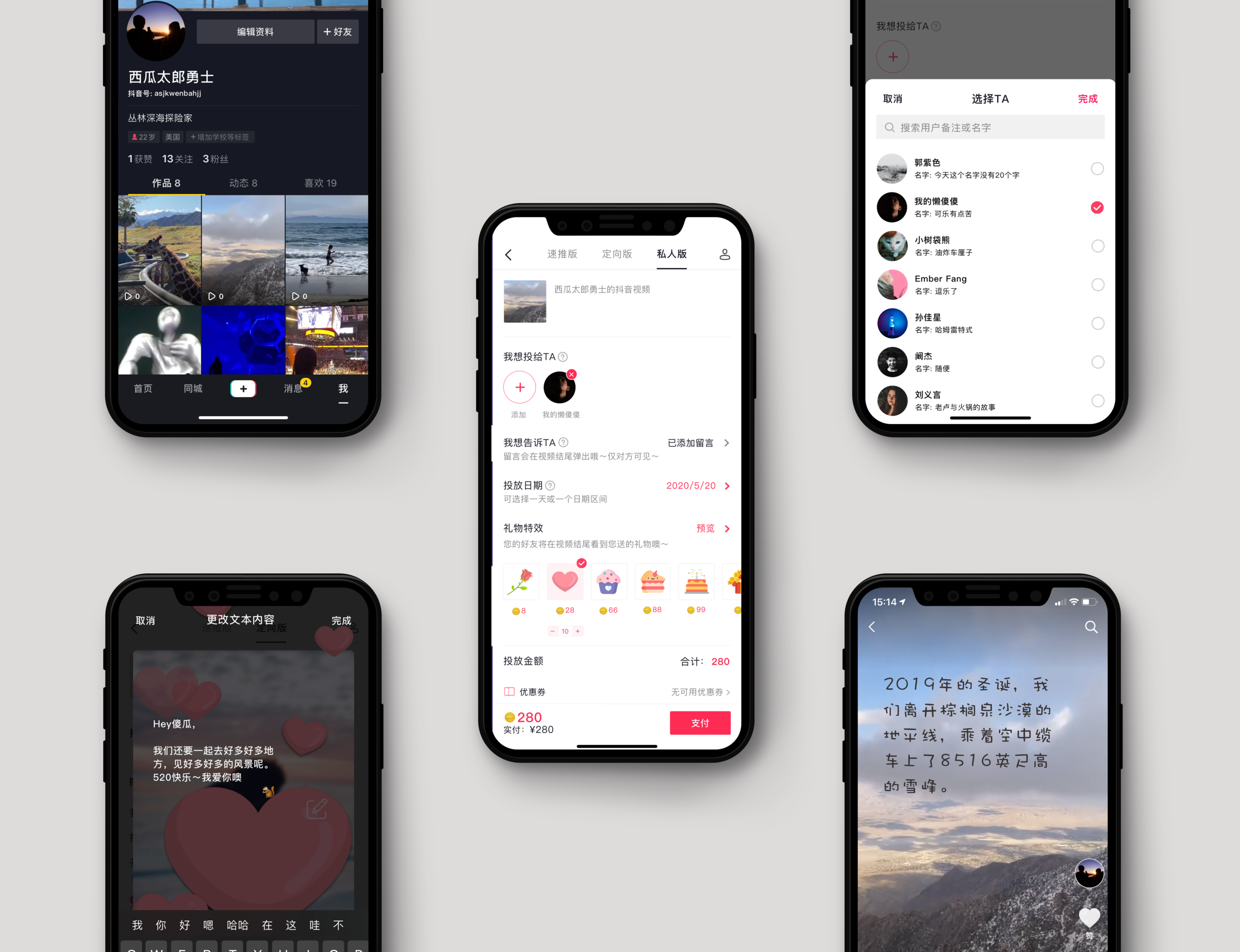
Final Design
Success Metrics
Since this project is about creating a new feature for [DOU+] for business need, I decided to focus on a more business-oriented metrics for product performance after launch. I will mainly gather quantitative data for evaluation and have some qualitative interviews for deeper customer insights.
Acquisition: Have 20% of users click into this feature tab page from in-app promotion, friend referrals, or [DOU+] original page (evaluate each percentage.)
Complete actions: 80% of users should be able to accomplish the task. 40% of them will spend over ¥10 on the virtual gift.
Retention: 30% of users will come back after a first time use of this feature. (Evaluate if they are trying to use it in another way: to other users? send other gifts? Pick different time durations?)
Referral: 10% new click-in are through referral.
Reflections
Challenges
Analyzing the ultimate business goal and team goal myself due to limited accessibility to product manager.
Conducting detailed interviews, brainstorms and usability testings with the time limitation(2 days).
Balancing familiarity and creativity of an existing product’s layout and workflow with the new feature.
Takeaways
This is my first cross-culture UX project and I couldn’t stress out more about the importance of “User-centered design” . Tik Tok China’s user group and behavior pattern is very different from Tik Tok US’s. I believe I wouldn’t be able to come up with the solutions without deep insights from Chinese users.
Know my role and my team’s business goal. When an idea doesn’t seem to fit our team’s existing products. Try to solve this problem by brainstorming instead of just giving it up. It can be an opportunity, not a barrier!
Business goals and user needs can sometimes inspire each other and bring benefits to both. Don’t undervalue any side and always be willing to embrace new ideas.
A/B Testing is a quick and useful way to find out which solution is better instead of working on my own assumptions.
If I had more time
Bring my first design to stakeholders to get their early feedback for further iteration.
Do more rounds of usability testing with the high-fidelity design to confirm some of my interface design assumptions.
Further brainstorm and explore with the interface layout.
Consult product manager about the “receiver” side of user experience and how to promote this feature. I have some pitch ideas(in-app promotion and friend referrals) but it is better to ask if it is needed first.
